Situation
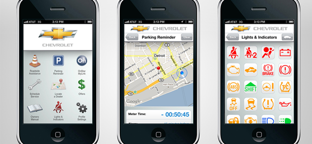
In 2016, General Motors (GM) spent millions of dollars yearly on a collection of limiting and fractured mobile apps. Despite the effort and resources directed towards the mobile channel, the apps failed to serve owner needs or drive owner engagement. The apps’ failure also limited the relevance of the brands (Chevrolet, Buick, GMC, Cadillac, Opel, and Vauxhall) to in-vehicle interactions. Compounding matters, vehicle sales volumes were shrinking, making it critical for GM to find additional revenue streams.
While GM sold a few million new cars a year, there were several times as many GM vehicle owners with older cars. Finding a way to be of service to them could generate millions in revenue, but apps deleted after a single use would never get us there.
I was hired to manage the teams responsible for user research, information architecture, user experience design, visual design, service design, and copywriting across our mobile apps and desktop sites, as well as the impending in-vehicle presence of Apple CarPlay and Android Auto.
Task
Concerning our mobile apps, my task was to create a singular app (code-named Omnibus) that would unify existing functionality and provide a platform for driving service revenue opportunities with existing owners. Our challenge was to produce a mobile app that:
- Expanded our connected vehicle services (OnStar) globally
- Provide a platform to realize new service-driven revenue streams
- Reduced our production costs
Of course, that could only happen if we could stop owners from deleting our apps. So job one was to create an experience within the app that owners would engage with and value.
Action
My first task was to create a research plan that allowed us to understand the challenges from the owners’ perspective. Through qualitative interviews and analysis of in-app analytics, we determined that the app had to do three critical things:
- Increase Owners’ Awareness of Needs — The primary purpose of owners using the apps was safety and security. As such, we needed to ensure they could always recognize when their vehicle required attention.
- Reduce Errors in Utilizing the App — The owner base was diverse (dozens of countries, tons of languages, and conventions), and adding to the challenge, vehicles varied greatly in features and functionality. The apps had to reflect the needs and capabilities but could not add complexity at the cost of usability. So feature discoverability was critical.
- Reduce the Cognitive Load of Owners — In a related aspect, we need to create an app environment that would not barrage owners with so many new features that they cannot remotely start a car or become aware of a flat tire.
Armed with this research, the teams and I spent the next few weeks in a focus room to:
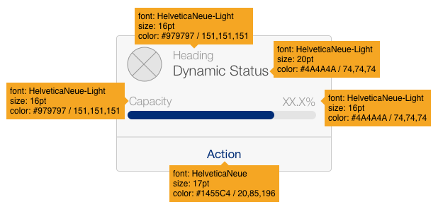
- Document every pixel of the existing UI, every data field, every text label, and every function.
- Find divergent and common visual patterns, but as significantly from the perspective of owners’ needs.
- Harmonize those needs in a cohesive manner that allows us to find patterns that can be applied across the interface.
We began designing the new UI through wireframes and used a few design tools to stitch together the wireframes for early owner testing. We added additional features to the app and modified the patterns rather than individual controls or screens.
Once we had a strong foundation, we began layering in requirements such as brand guidelines and language needs.
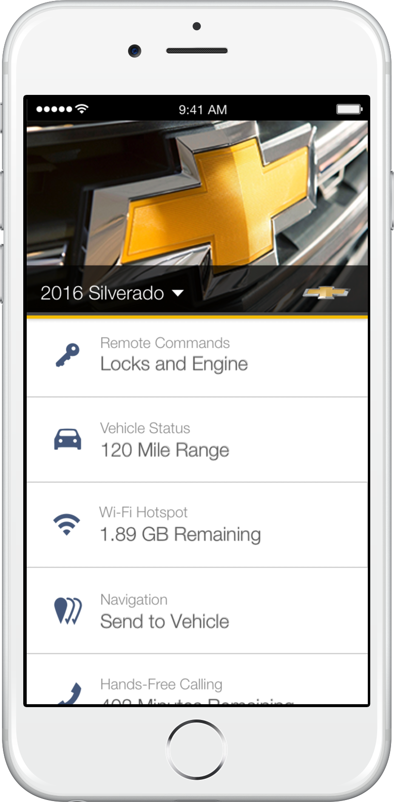
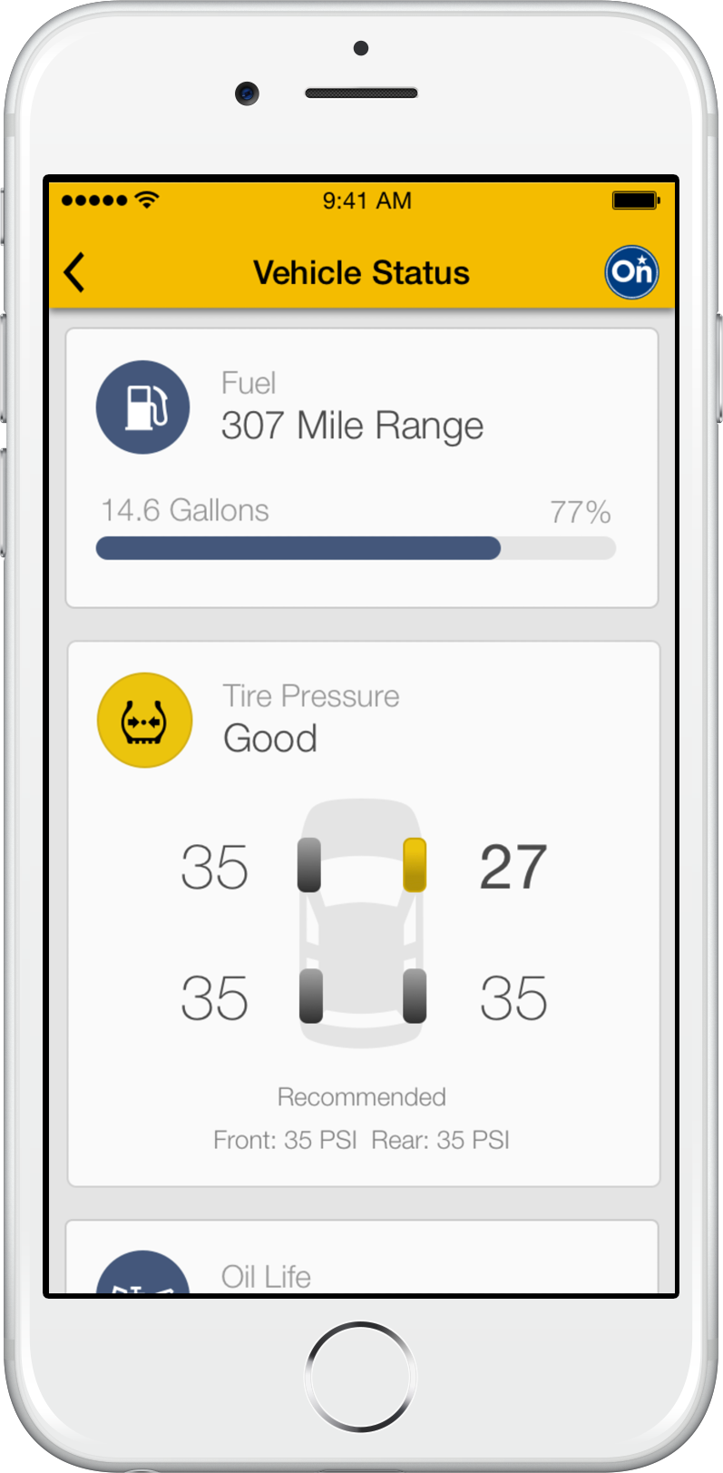
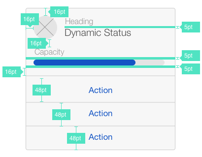
Within a few months, we designed a platform on a handful of core visual elements. Adapting those key elements produced patterns owners could easily recognize and utilize throughout the app.
This pattern drive design would enable owners to utilize new features they had never seen before (such as with our EV vehicles or parking functionality) while not losing track of flat tires and pending oil changes.
We did all this in a manner that allowed our development and QA teams to move even faster. The primary reason being they were rarely ever building new controls from scratch; instead, they were writing new backends to existing patterns that extended features and functionality.
Results
The redesign was successful immediately on three fronts:
- Reducing production costs — We could code, test, and launch faster with pattern-driven design and development. Such a redesign would have taken multiple years leveraging the prior design language.
- Expanded GM’s connected vehicle services — The effectiveness of the UI and speed of development allowed us to launch seven branded apps in dozens of countries, supporting 23 languages. We had never had such extensive coverage so quickly.
- Drive engagement and preserve value to owners — Testing provided evidence that owners could recognize items that needed their attention at 4x the rate they could in the prior apps. In-app analytics were proving that they were exploring additional functions on the apps, such as parking features, which were the foundations of in-app service revenue gambits.
Several years after my departure, the apps still leverage this design language and have extended service revenue capabilities, all while maintaining a 4.9 out of 5 app rating on the Apple store with over 378.2K ratings.