Situation
As the Analytics & User Experience Manager for the Centers for Disease Control and Prevention’s (CDC) National Center for HIV/AIDS, Viral Hepatitis, STD and TB Prevention (NCHHSTP), I led a mixed badge team (CDC and Contractors) with responsibility for web metrics and user experience over the center’s 18+ websites and tools.
Our core focus was to support the center’s analytics and UX needs for site and app design, redesign, usability testing, metrics analysis, and research projects.
The tools and sites generated more than 70 million page views annually.
In 2010, the White House released a comprehensive National HIV/AIDS Strategy, setting “quantitative goals for reducing new HIV infections, improving health outcomes for people living with HIV, and reducing HIV-related health disparities.” Lower-income, minority populations were increasingly living with the disease, and their struggles represented an increasing health disparity in those affected.
The work of developing and implementing a plan to turn the Executive Order into reality fell to NCHHSTP.
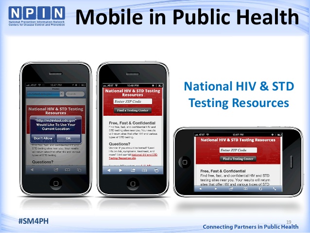
Our research into the audience’s web behaviors indicated that our focus should be on mobile users. While lower-income minorities did not have broad access to the internet via desktops, the research showed that they were gaining access via the burgeoning mobile market.
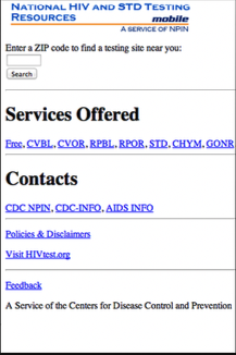
At that time, the center had a dedicated mobile website (m.hivtest.org); however, the traffic was marginal, and the conversion rates (the users going from the home page to a testing/service center’s page) hovered around 11%.
Task
We needed to create more page views on this site and even more critically we needed to improve conversion from the site to testing centers.
Action
After some initial web metrics analysis, we began testing the site with users to find areas we could improve.
Our testing indicated that the content we had in place was indeed what site visitors wanted. The challenge was that the site utilized coded terms such as “CVBL” or “GONR” which, while well known amongst public health professionals, were essentially a foreign language to the site’s users.
Worse still, we knew that first-time visitors have considerable trepidation. HIV and AIDS are not only terrifying diseases concerning health and mortality, but they also stigmatize their victims. The old mobile site did not address those concerns, and our research indicated that those concerns were barriers to higher conversion rates.
A final factor we discovered in our analysis was that not only were our target users coming via mobile devices, but they were also coming from various mobile device platforms and form factors. This trend showed no signs of abating, with phone manufacturers releasing dozens of resolutions across multiple OSs and browsers.
Given these challenges, our design recommendations were reasonably straightforward:
- Utilize a responsive web design to bridge the platform/resolution disparity.
- Rewrite the core content of the site in plain language.
- Add new content that addresses the concerns users would have about the site and the disease
Results
After a few rounds of testing and tweaking, we launched the redesigned mobile site in June of 2012, coordinating the launch with state agencies and advocacy groups. While we expected increased traffic and conversions, we were blown away by the results.
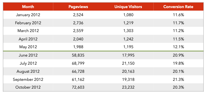
Page views increased dramatically from 1,988 in May to 58,835 in June. While the count of Unique Visitors rose from 1,195 to 17,995, the percentage of traffic they represented dropped.
While this would usually be a source of concern after a redesign, this was a part of our redesign strategy. We believed that by adding content that addressed areas of concern, more users would search for testing and service centers. Our metrics analysis provided proof of just that. Each visitor viewed nearly twice as many pages (1.7 vs. 3.3 pages/visitor).
The ultimate goal for the redesign, to increase conversion rates, was more successful than we could have hoped. Conversion rates increased by just over 72% in the first month and over 76% across a 5-month average.
The redesigned mobile testing site reached more users, easing their concerns by providing them with more information and getting them to pages that provided information on how and where to go to get HIV testing and services.